Refining Chowbus’ Ordering Experience
Help people make decisions on food ordering

Background
Chowbus is an online food ordering and delivery platform. Its mission is to bring high-quality, authentic Asian foods to their consumers.
Our team chose Chowbus as our case study topic in a UX research course since many people complain about its interface and ordering process. I continued the design individually based on my personal interest after the class ended.
*Visualized process
Challenge 1: Dealing with ambiguity
How did we learn?
We started to understand the problem by asking questions
– Qualitatively:
Interviewed current users to understand what do they care about while ordering food on Chowbus.
Use think-aloud to observe users’ strategies to find desired food and whether the current flow and interface are easy to use.
– Quantitatively:
Spread out a survey to identify Chowbus’ target users. What character of the Chowbus app do they like/dislike the most.
PERSONA
This persona allows me to focus on helping users find the desired authentic Asian food and place orders easier
JOURNEY MAP
By filling our findings in a customer journey map, we found redesigning the review feature in the SHARING stage is a key to provide better experience in the ORDERING stage
What we’ve learned?
After analyzing the collected data, we learned it’s a complex problem across the app and identified four factors that are hurting the overall experience.
DESIGN RECOMMENDATIONS
-
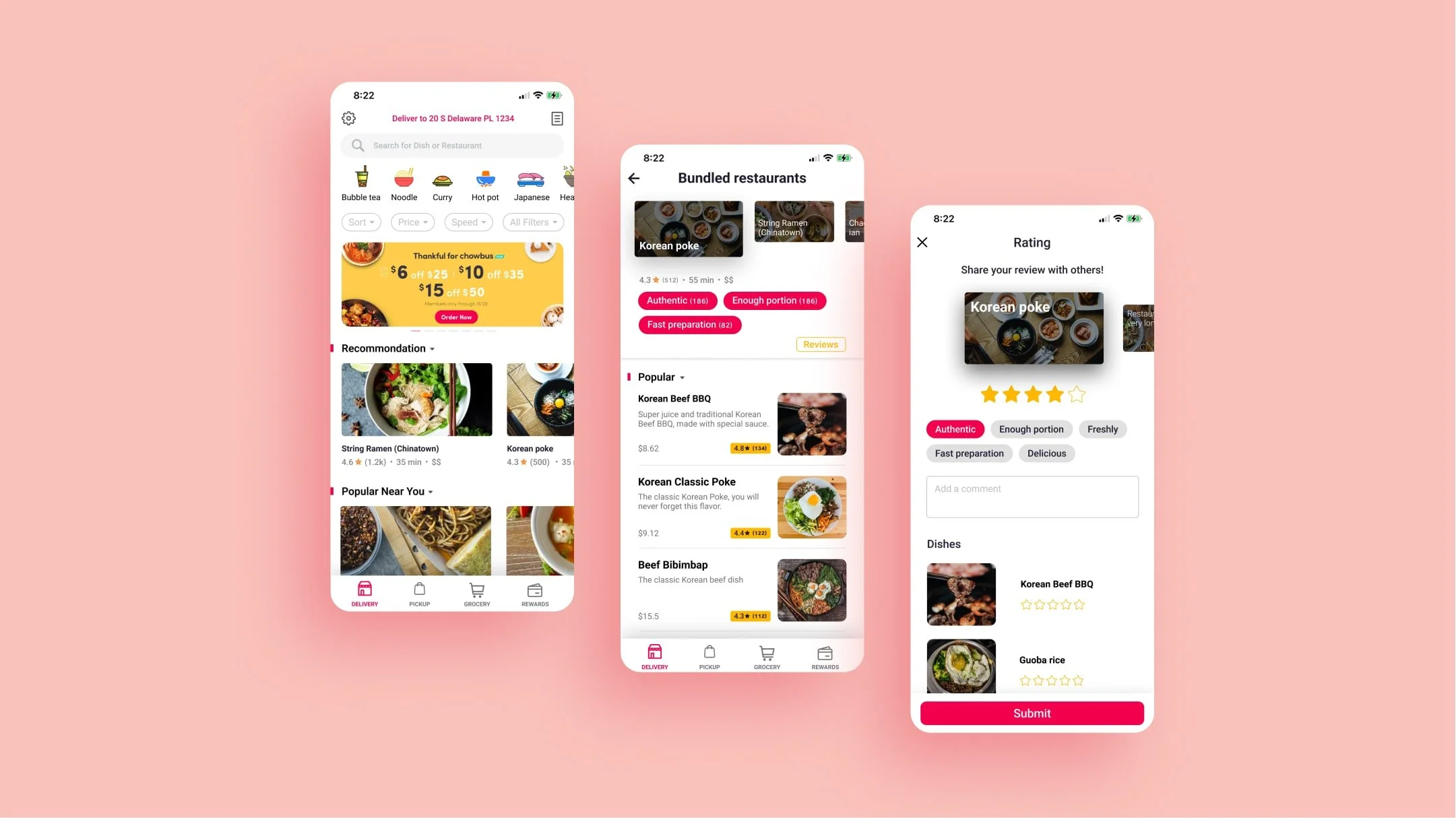
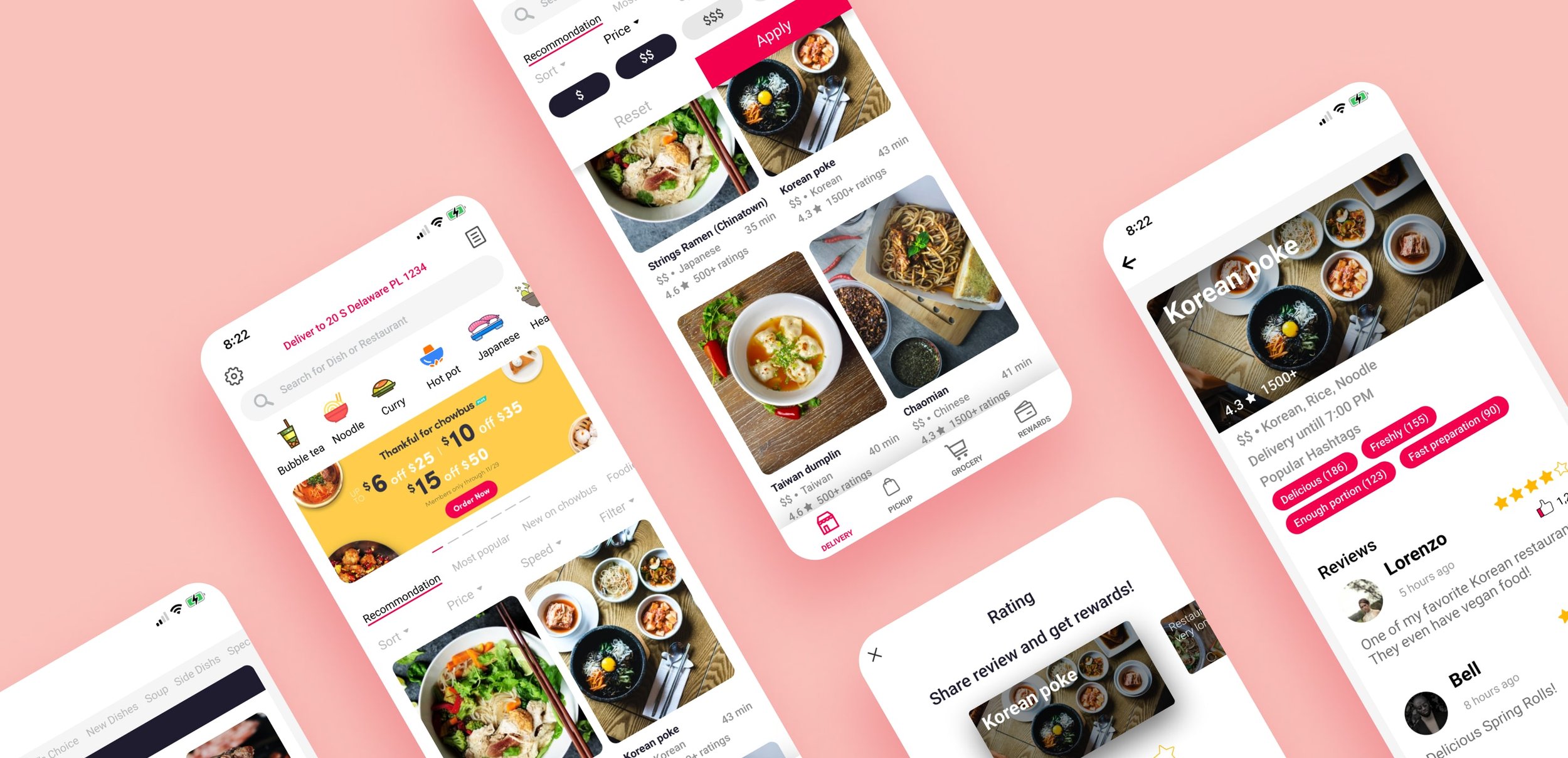
To make the app more helpful in making decisions, we suggest adding a new review feature so that users can see how other people think about certain dishes also they can share their experiences.
-
Redesign how the bundling feature appears to customers so it isn’t that confusing anymore.
-
Redesign the filter feature to help users locate what they are looking for faster.
-
Improve the options screen to prevent Add error handling to help users fill out the order.
-
Allow customers to save restaurants or dishes into their favorite list, so they can quickly locate what dish they want in the future.
-
Allow multiple users to order together on their own device at the same time.
-
To make the grocery option more robust, Chowbus needs to adjust the search and categorization elements within the service.
Challenge 2: Knowing how to prioritize
How did I design individually with fragmented time?
Now I know there are too many problems with this app. The other challenge is I have limited time and no partner. Although it became a personal project, I tried to solve those problems ASAP and took 2 actions:
By listing all problems and going through previous research,
I evaluated issues based on impacts & efforts.Had Reduce Choice Overload as the top principle to help me make design decisions.
Evaluate Effort
I evaluated the effort based on my professional development experience
Usability testing
I conducted 5 usability tests to see whether my wireframes based on the principle, Reduce Choice Overload, work or not.

Solutions
Existing Screens
THE IMPACT
The average difficulty of using filter decreased by 72%
The time spent from home screen to restaurant screen decreased by 60%
TAKEAWAYS
Positive results and much more to do
According to the feedback, the redesign of the Chowbus app has a positive impact on the discovering experience. However, if I were a UX designer at Chowbus, I would ask the data team to monitor the rate of giving reviews. I believe the rate will increase, but we might need other solutions to make people feel more engaging to share their thoughts.
It would be better if research is along with design
Although I included user feedback in my final design, the filter could be better designed if we conducted card sorting to group categories. I encountered many problems in the design stage. I believe if there were a research team that could collaborate with me, the result could be better.


