We All Code Intake
PRODUCT DESIGN · RESEARCH · DEVELOPMENT
INTRODUCTION
We All Code is an NPO that provides free educational resources and hands-on coding classes to kids.
Overtime, they found the old experience failed to intake first-time users successfully. A lot of people left the website during the intake process.
In 2021 summer, we set out to redesign the intake experience to provide a modern and supportive website that works equally well for target users.
MY ROLE
Research, design, user testing, development
THE TEAM
3 designers, 1 CEO
TIMELINE
June 2021 - Aug 2021

SOLUTION
FINAL DELIVERY
The intake process completion rate increased by 300%.
Helping volunteers and parents go through the intake steps effortlessly.
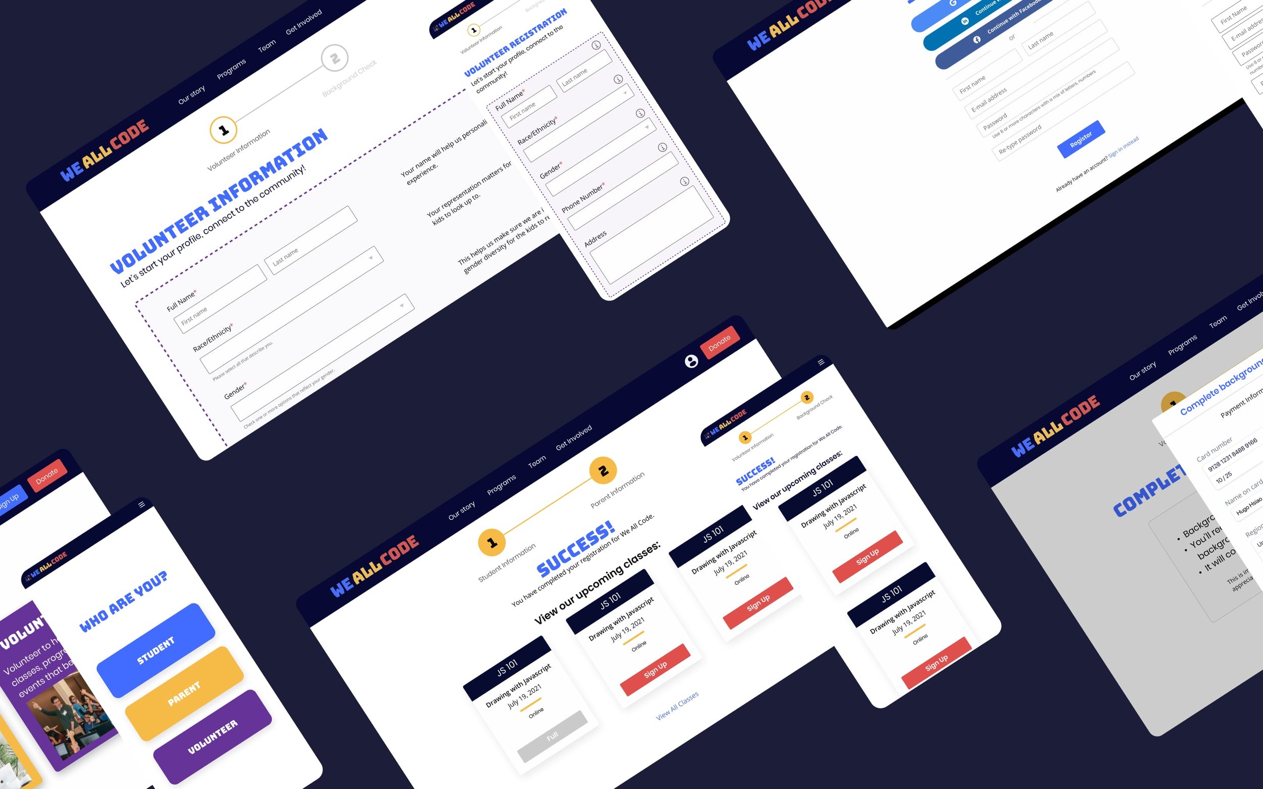
Overview of the redesigned experience
New volunteer intake (live site)
NEW DESIGN
GUIDED EXPERIENCE
The new design strives to provide better guidance. Users can focus on things that matter at each step.
FLEXIBLE MANAGEMENT
Parents are now able to manage student forms flexibly. No more confusion!
NEXT STEP
Available classes are what our users care about the most. So here they are!
SUPPORTIVE FORM
The new form is now much easier to fill out.
Transparent. Guided. Prepared options to speed up the process.
HIGH FIDELITY WIREFRAME

THE PROCESS
PROBLEMS
If you want to volunteer at We All Code, you won’t know you need to do a background check.
If you want to register your kid as a student here, you’ll get lost first.
OVERVIEW OF THE OLD EXPERIENCE
RESEARCH
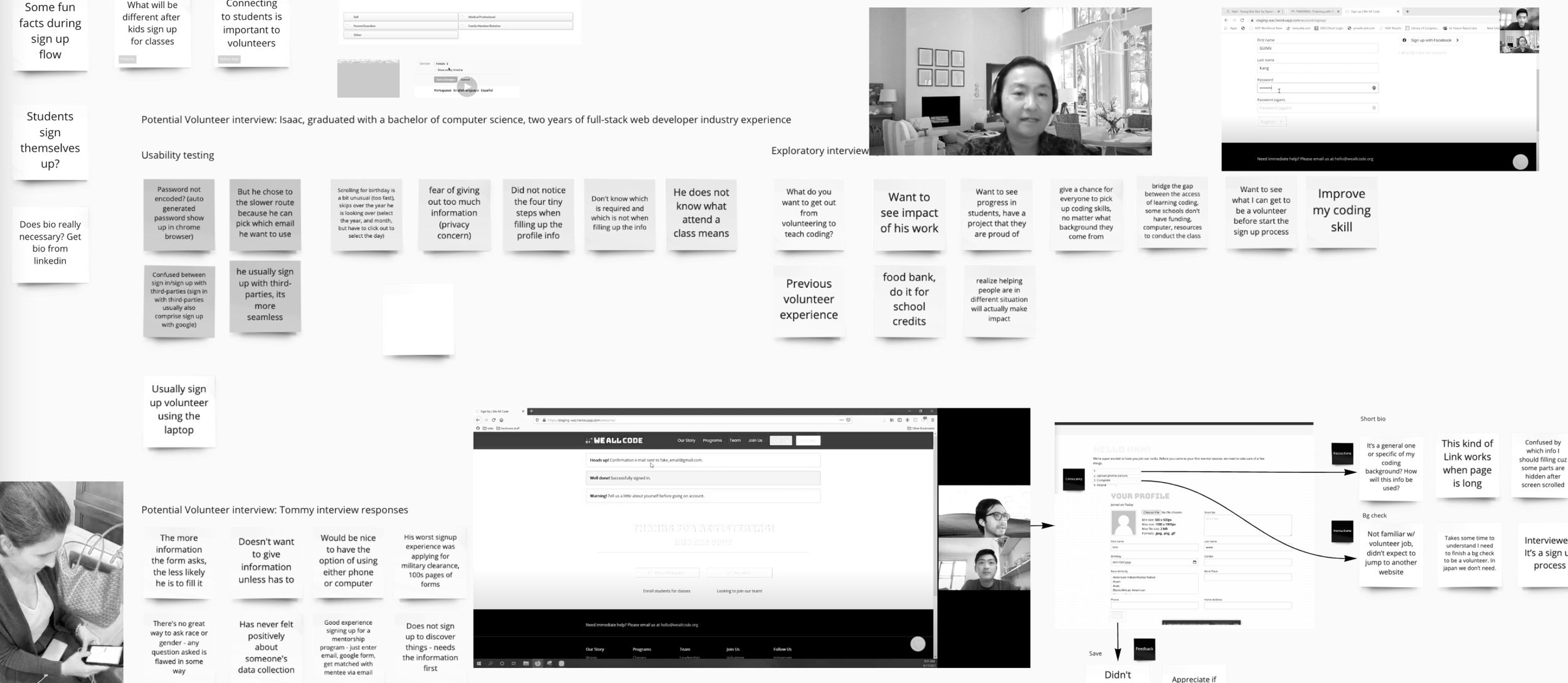
We conducted user interviews and think-aloud testing to understand:
> What matters for users when joining We All Code?
> What are the key reasons leading to low retention during the intake process?
Persona of parent
Persona of volunteer
Most stood out issues
SUMMARY
Poor navigation is the reason users drop off during the intake process.
TRANSLATE NEEDS TO
SOLUTION
HOW MIGHT WE
design an intake process that provides users a simple and straightforward experience?
GUIDANCE
Based on our research, guidance becomes our top principle. Users should always know where I am, what I need to do and if I do right.
SINGLE-STEP FORM
Our testing indicated users prefer single-step form much more than multi-step.

PROJECT SUMMARY
IMPACT
Based on our testing result, the intake process completion rate increased by 300%.
It helps people register as volunteers at We All Code much faster (5 min to 1 min). Also, parents can finish the student registration more effortlessly and flexibly.
Lesson Learned
1. Users care about convenience a lot. They can endure more information for it than I thought.
I thought users would prefer fewer fields with multi-step forms since it is less overwhelming. However, our tests indicated that the convenience of confirming fields (single-step form) is more important to users.
2. Don’t fall in love with one solution too much.
We had a tough time designing a fluent volunteer flow because we tried to include the wrong element (an element from the original site) in the new process. After we head back and do home works on background check, we learned there are many other possibilities. We discussed with the stakeholder and got permit to replace the original element.
3. The strategy of form design
Provide clues to show whether users are doing it correctly.
Prevent error -> provide tips to fill out the fields.
Avoid low-priority fields.
If possible, use a dropdown with prepared options.
Users do care about their data, add field explanations.
The end
Behind the Scene
—
Behind the Scene —
New workflow
Lo-fi wireframe
Affinity map
Code
Design guideline


